
Milos
E-commerce platform to better connect coffee enthusiasts with their favorite blends.
Overview
Milos Coffee Roasters, was founded in 2015 and based in San Diego, is known for delivering ethically sourced, high-quality coffee. Their mission is to help customers bring the perfect brew experience home. With growing demand and a loyal local following, Milos wanted to expand online and offer their freshly roasted beans through a new e-commerce platform.
Milos needed a digital experience that reflected their brand values, quality, transparency, and warmth, while making it easy for customers to browse, learn about, and purchase coffee online.
Let’s dive into this case study, from the company’s branding all the way through to the launch of the final website.
Role: Product Designer
Skills: Branding, Logo, Marketing, User Research, Interaction, Visual Design, Wireframes, Prototyping & Testing
Tools: Figma, Photoshop, Illustrator
Project Duration: 50 Hours
Prototype: Milos
Understanding the problem
Since 2015, Milos Coffee Roasters has built a loyal following in San Diego by roasting high-quality, ethically sourced beans and creating a warm, welcoming café vibe. As interest in their coffee grew, they realized many fans couldn’t easily get their beans without visiting in person.
I saw three main issues to tackle:
- Fans wanted an easy way to buy Milos beans online, anytime, anywhere.
- The café’s farm-to-cup story and roasting details weren’t available online, making it hard for new customers to connect with the brand.
- First-time buyers needed confidence in Milos quality and ethical sourcing before clicking “buy.”
Key pain points identified
-
No easy way to buy online: Fans love Milos beans but can’t shop unless they visit the café in person.
-
Missing brand story: The farm-to-cup journey and roasting details live only in the shop—online visitors don’t get that connection.
-
Unclear product information: Without roast levels, flavor notes, or origin filters, it’s hard to find the right coffee.
-
Competitive disadvantage: In a crowded coffee market, not having an e-commerce site makes Milos look behind the times.
The Goal
My goal was to bring Milos’s friendly, community-focused spirit into a straightforward online shop. I needed to balance inviting storytelling with clear product information, so visitors could learn about each roast, filter by their preferences and feel good about every purchase.
Building User Empathy
To design an online shop that truly feels as welcoming and intuitive as walking into the Milos café, I leaned on both in-person chats and stakeholder insights. Here’s a closer look at the four key customer groups I focused on:

Coffee Enthusiasts & Home Baristas
-
Who they are: 25–45 years old, tech-savvy creatives working remotely or in a hybrid setup.
-
What drives them: Experimenting with new beans, grind sizes, and brew methods (Chemex, V60, French press).
-
Needs & frustrations:
-
Easy access to small-batch, ethically sourced beans.
-
Detailed tasting notes and origin stories to guide their next brew.
-
Quick reorders when they run low on favorites.
-

Busy Professionals
-
Who they are: 30–50 years old, executives or consultants with little free time.
-
What drives them: High-quality coffee that fits into a packed schedule, often via subscription.
-
Needs & frustrations:
-
One-click ordering or subscription sign-up that refills automatically.
-
Reliable delivery so they never run out during a busy week.
-
Minimal browsing—they value speed over exploration.
-

Gift Givers
-
Who they are: 30–60 years old buying for friends, family, or colleagues.
-
What drives them: Finding a unique, high-quality gift that feels personal.
-
Needs & frustrations:
-
Gift-ready packaging and easy checkout flow.
-
Clear descriptions so they can pick the right roast for the recipient.
-
Suggested pairings (e.g., beans + brewing kit) to add value.
-
Environmentally Conscious Consumers
-
Who they are: College-educated Millennials and Gen Z in urban areas like Portland or Brooklyn.
-
What drives them: Brands with transparent, sustainable, and fair-trade practices.
-
Needs & frustrations:
-
Visible certifications (organic, fair trade) front and center.
-
Eco-friendly packaging options and recycling info.
-
Stories about the farmers and communities behind each bean.
-
Research & Insights
To ensure Milos’s e-commerce site stands out and meets real customer needs, I combined stakeholder info with competitor analysis. Here’s what I found:
Competitor & Market Analysis
Direct Competitors
-
Dark Horse Coffee Roasters: Clean product pages, clear origin details, and strong subscription options.
-
Bird Rock Coffee: Emphasizes local San Diego roots with rich storytelling and high-quality imagery.
-
Jaunt Coffee Roasters: Focuses on educational content—brewing guides and farmer spotlights.
Indirect Competitors
-
Starbucks: Best-in-class mobile app with quick “order again” and loyalty rewards.
-
Dunkin’ Donuts: Simple, speedy checkout and frequent promotions/subscription tiers.
Opportunity for Milos
-
Bring together the storytelling depth of direct competitors with the seamless reordering and loyalty features of big chains.
-
Lean into Milos’s local café community vibe to differentiate from national brands.
Key Insights
Subscription + Discounts
- A must-have for busy pros and enthusiasts alike.
Deep Transparency
- Roast dates, origin stories, and farmer profiles build trust.
"Quick Add" option from Home and Products Page
- “Quick Add” option so users can add products to their shopping carts without opening the product page.
Rich Visual Storytelling
- Photos of the café, beans, and roasting process deepen the brand connection.
Mobile Checkout
- Since most customers shop on their phones, once the desktop flow is finalized I’ll adapt it into a streamlined, mobile-first checkout. This means a single-page layout, minimal taps and fast loading so users can complete their purchase quickly and effortlessly.
Wireframes
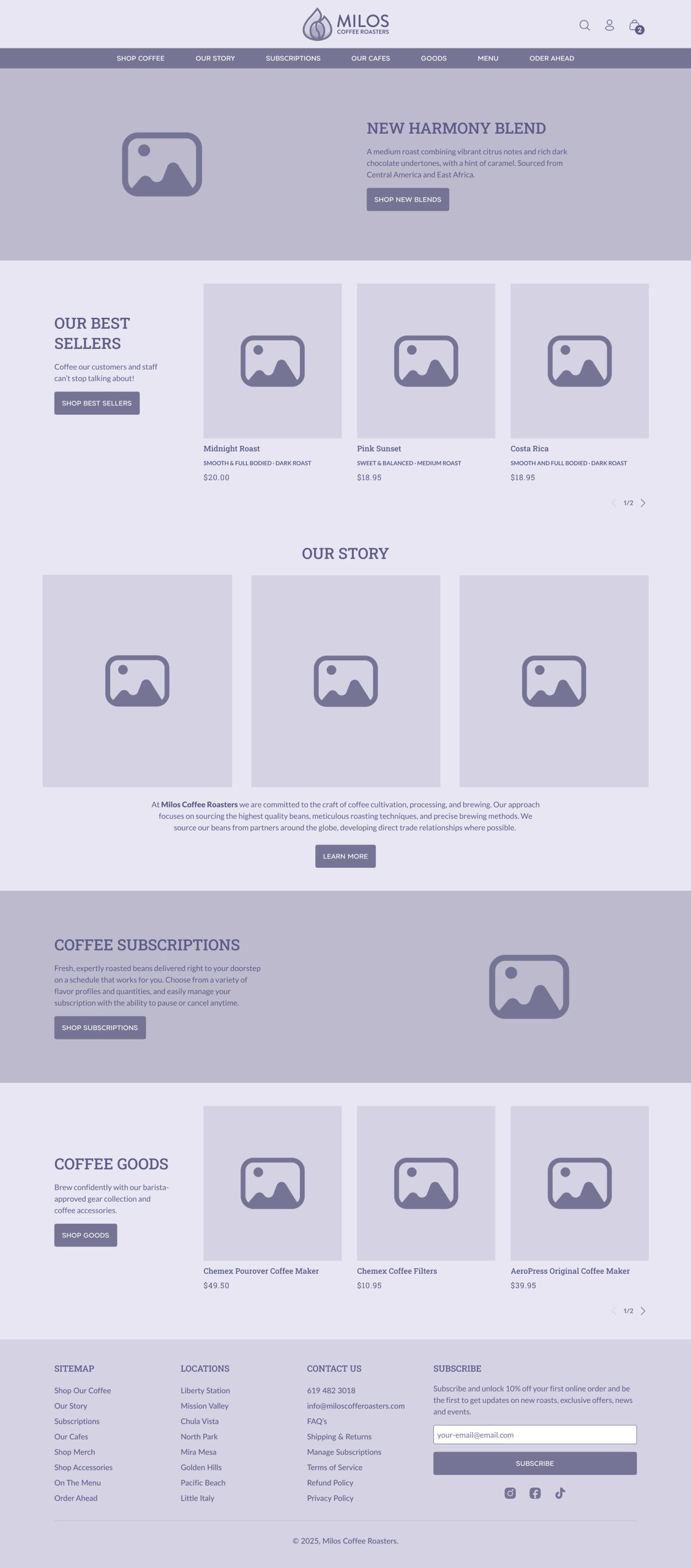
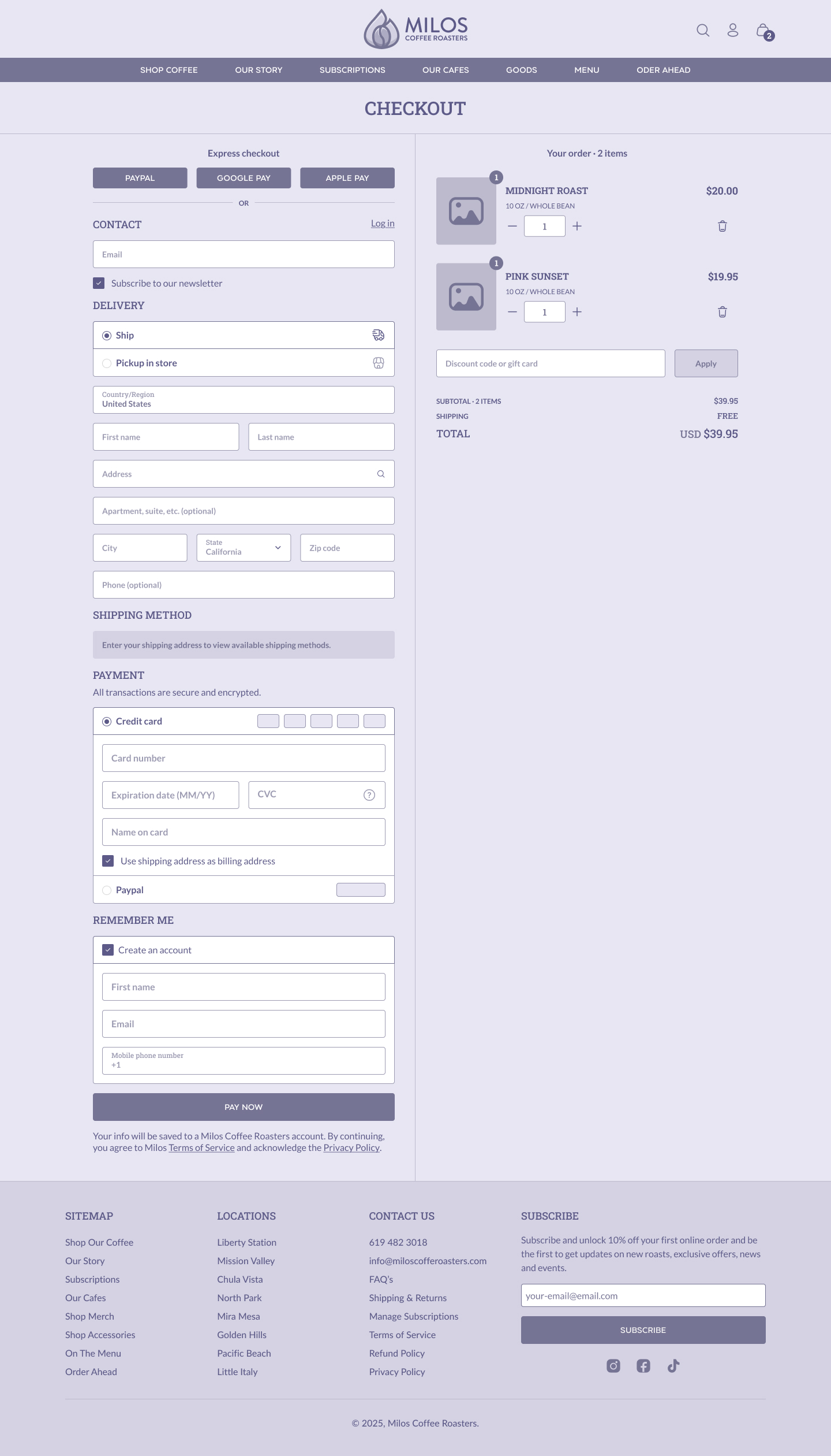
With clear insights in hand, I moved into sketching and wireframing to map out the core user flows:
High Fidelity Prototype
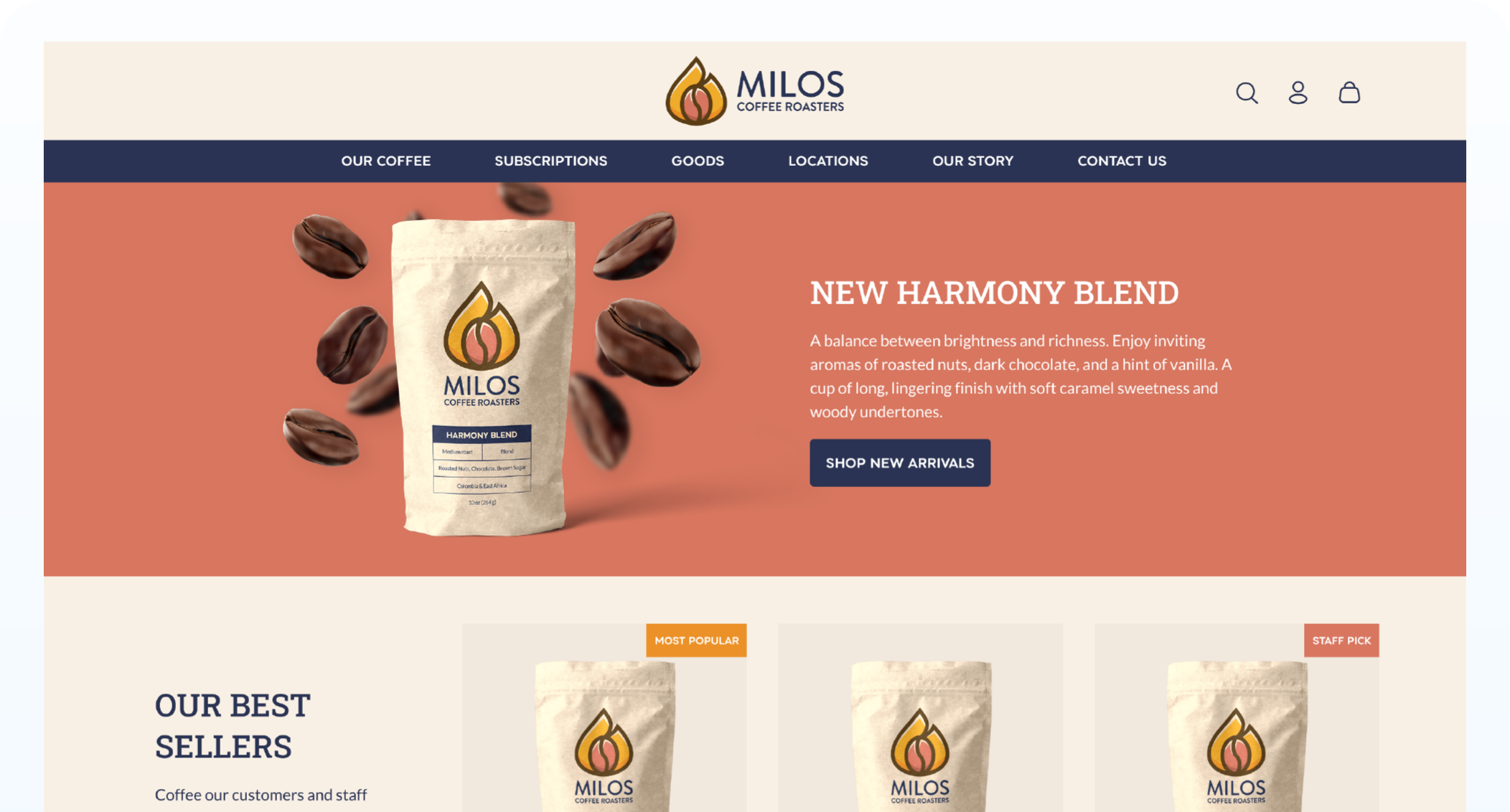
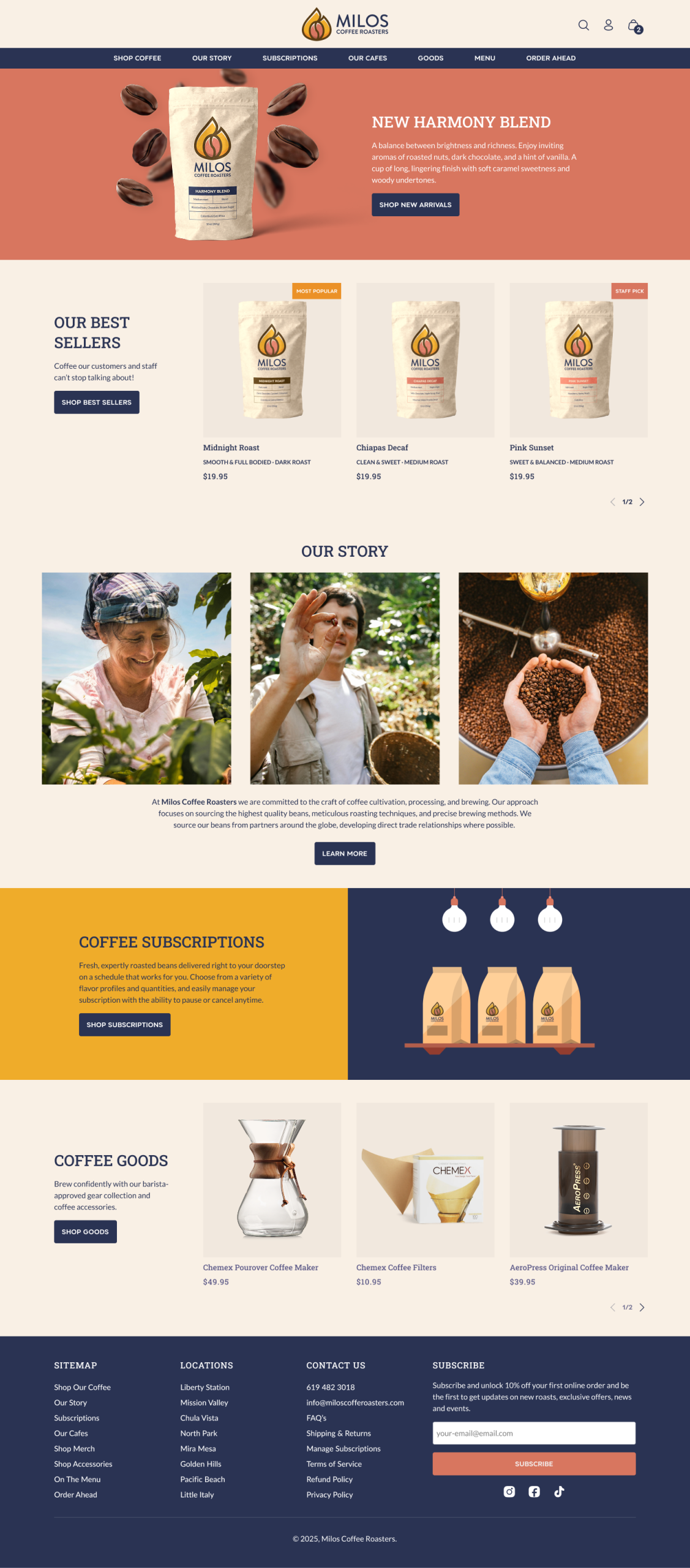
The goal of Milos Coffee Roasters homepage design is to produce an engaging online experience that instantly reflects the company’s love of craftsmanship and quality. The main goal is to build trust and engagement by guiding users smoothly from brand introduction to product discovery.
I structured the homepage with a strong visual hierarchy. To guarantee instant engagement, the hero section features a full-width, high-resolution image together with a clear tagline, a short description and a noticeable call to action. Users can easily find product specifications, our story, coffee subscriptions, coffee-related products and a footer with relevant links and a subscriber form. A consistent experience is guaranteed on all devices thanks to the responsive design, and accessibility was carefully considered with the use of suitable color contrasts and legible typography.
Key Decisions
- Emphasized storytelling to connect users emotionally with the brand.
- Integrated clear and direct navigation to reduce friction.
- Chose warm, inviting colors that reflect the artisanal nature of our coffee.
Usability Testing
Objectives & Approach
- Purpose: Assess the website’s ease of use, navigation, clarity of product information, and the checkout process.
- Method: Five participants, representing a mix of ages and tech skills, performed six task-based scenarios (navigating to product categories, finding a specific product, returning to the homepage, completing a purchase, and locating support information) and provided overall impressions via post-test surveys.
Key Findings
- Navigation: Participants successfully located key sections (e.g., “All Coffee” category and product pages) with a 100% success rate. Confusion arose due to ambiguous menu labels, users often misinterpreted “Menu” and “Our Cafes” when trying to locate product categories.
- Product Discovery & Homepage Navigation: Finding specific products (like “Midnight Roast”) was quick and efficient. Returning to the homepage was straightforward, primarily via clicking on the logo.
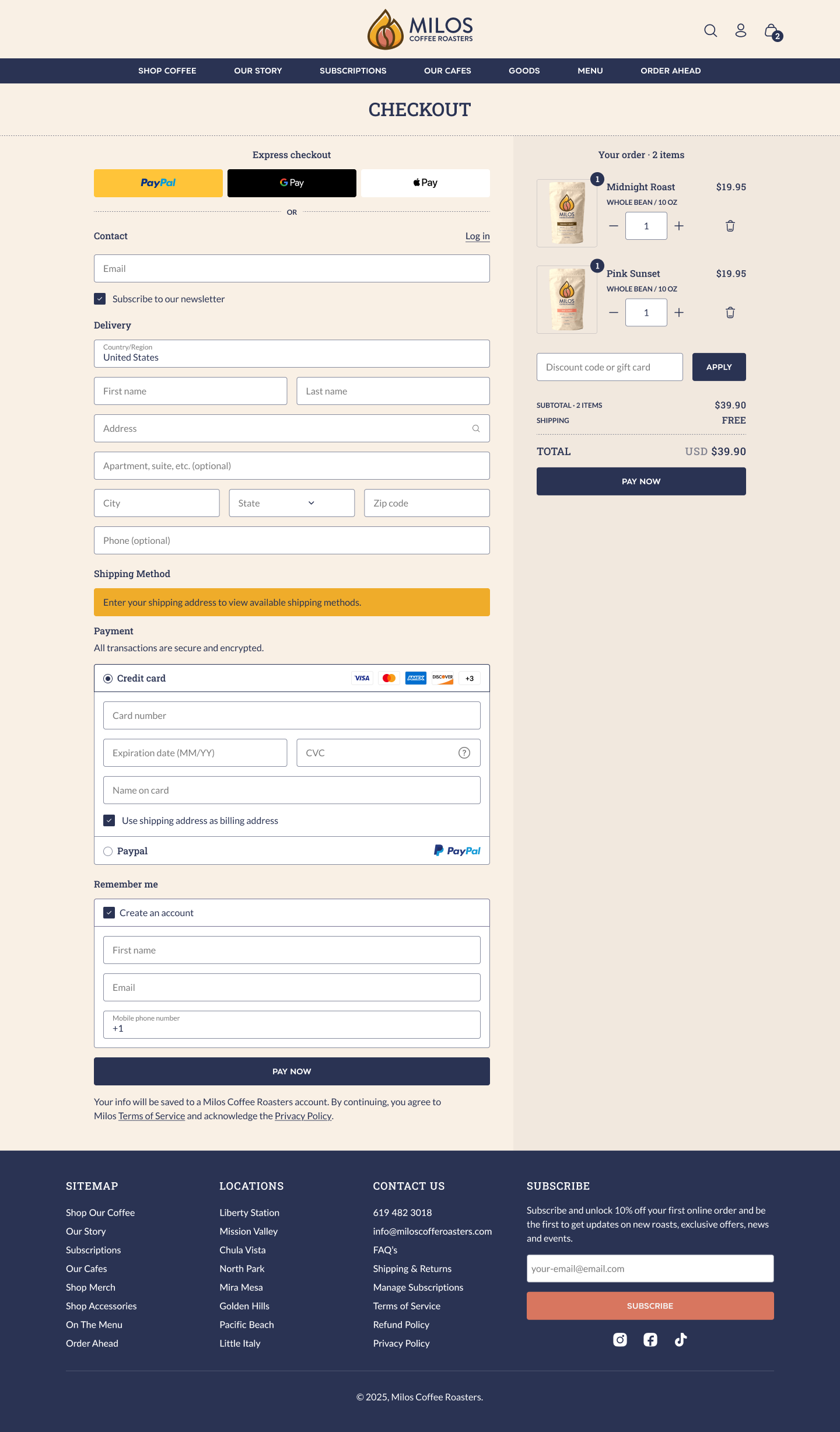
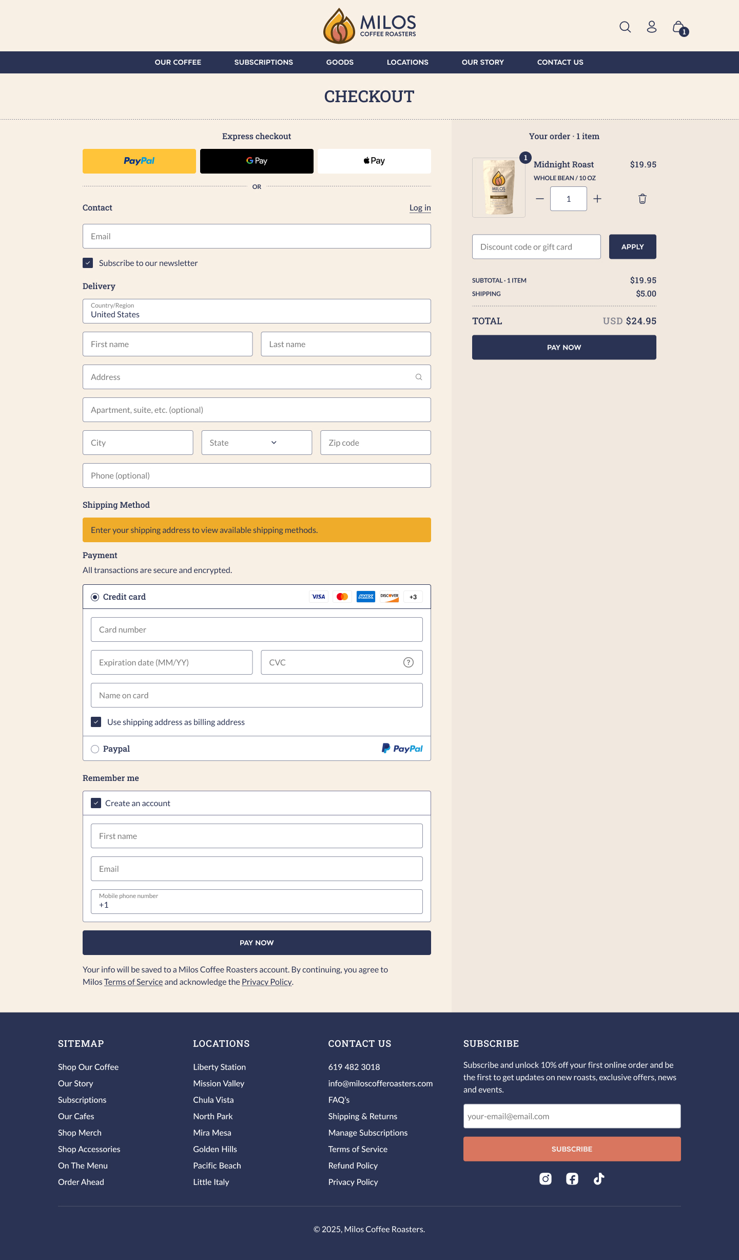
- Checkout Process: The checkout was efficient (100% success rate with an average completion time of 15 seconds). A notable issue was that users became frustrated when they encountered an extra product in the shopping bag that they could not remove.
- Support/Contact Information: Locating customer support details was generally easy, though one participant suggested a more prominent contact link in the main menu.
- Overall Satisfaction: The site received high satisfaction ratings (average score of 9.4/10), with users praising its clean design and intuitive layout.
Improvements and Final Prototype
Navigation Enhancements
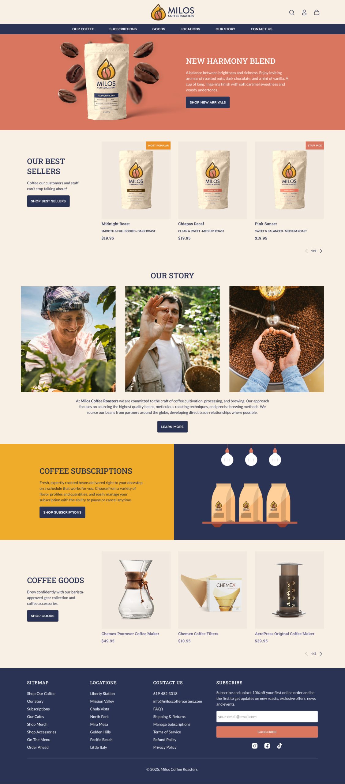
- Renamed menu items for clarity, changing “Shop Coffee” to “Our Coffee” and “Our Cafes” to “Locations.”
- Added sub-menu items like “Menu” and “Order Ahead” to logically group purchase-related links.
- Included a clear “Contact” link in the main menu to make support information more accessible.
Checkout Process Adjustments
- Clean Prototypes: Ensured that prototypes start with an empty shopping bag to avoid user confusion and frustration from unintended extra items.
- Avoiding Negative Patterns: Addressed the issue of the undeletable extra product, which was perceived as a potential “dark pattern” that could harm user trust.
Overall Impact
The usability testing confirmed the website’s strong foundation in terms of design and functionality. However, targeted changes, especially in navigation structure and the checkout process, were recommended to further enhance the user experience and minimize any friction during the customer journey. These insights and improvements were integrated into the next iteration of the website design to ensure a more intuitive and satisfying user experience.
Overall Impact
The usability testing confirmed the website’s strong foundation in terms of design and functionality. However, targeted changes, especially in navigation structure and the checkout process, were recommended to further enhance the user experience and minimize any friction during the customer journey. These insights and improvements were integrated into the next iteration of the website design to ensure a more intuitive and satisfying user experience.