
Caffenio App
Streamlining the Drive-Thru Coffee Experience for Seamless Ordering
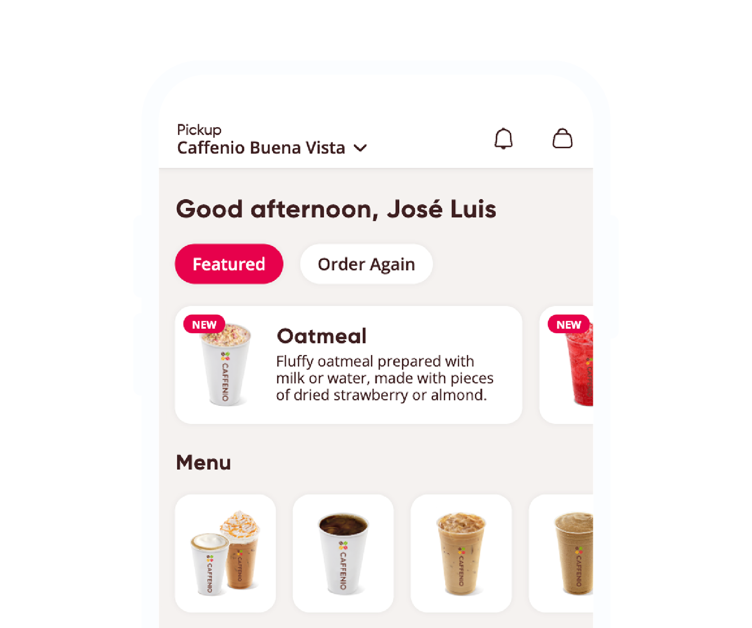
Overview
Caffenio is a prominent Mexican coffeehouse chain known for its drive-thru service and a diverse menu of coffee beverages and snacks. Founded in 2007 and headquartered in Hermosillo, Sonora, Caffenio has grown to operate over 200 locations across more than 50 cities in Mexico.
A concise overview of this case study highlights how I tackled a real-world user problem from research through validation. By simulating conducting stakeholder interviews and usability testing, I identified key pain points and crafted wireframes that prioritized clarity and engagement. Through iterative prototyping and feedback cycles, the final design improved task completion rates and received positive user sentiment for its intuitive flow. This presentation walks through my process, the challenges I overcame and the measurable impact of the solution.
Role: Product Designer
Skills: Branding, User Research, Storyboarding, Interaction, Visual design, Prototyping & Testing, Information Architecture
Tools: Axure, Photoshop, Illustrator
Project Duration: 50 Hours
Prototype: Caffenio
Understanding the problem
Caffenio’s leadership and operations teams have observed that very few customers are using the in-app pick-up ordering feature, opting instead to queue at the drive-thru kiosk. This underutilization not only results in wasted possibilities for order-ahead convenience and money through additional features, but it leads to bottlenecks at the kiosks, increasing wait times for everyone and staff workload during peak hours.
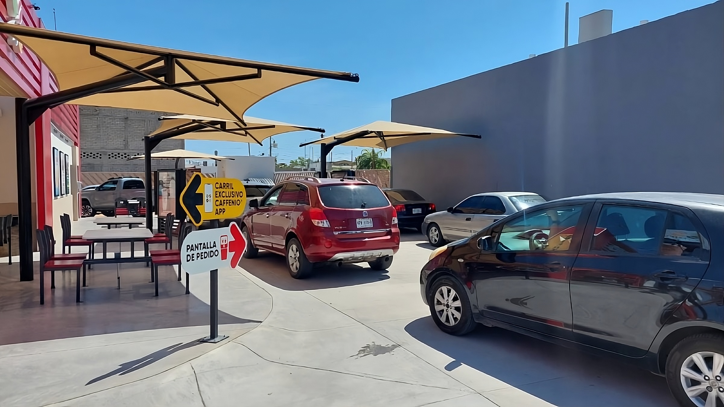
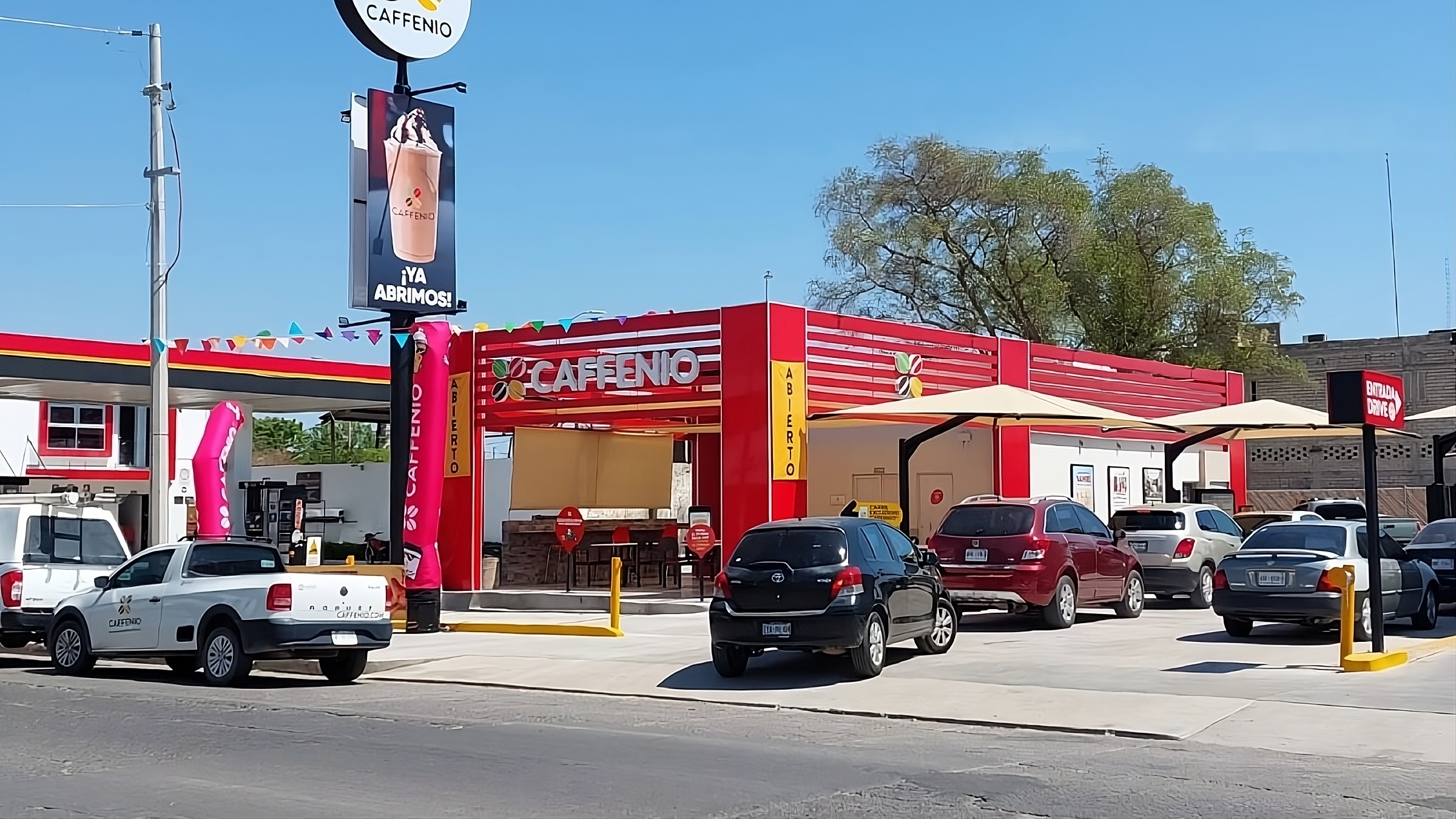
Black arrow: Order through app exclusive lane. Red arrow: Kiosk ordering.
Key pain points identified:
- Low Pick-Up Adoption: Despite targeted promotions and roadside signs, less than 10% of total transactions are now processed through the dedicated pick-up line.
- Drive-Thru Congestion: Customers who are unfamiliar with or unable to locate the app's pick-up option default to waiting at the kiosk, causing vehicles to back up into the main drive-thru lane.
- Order Errors and Friction: Without saved favorites, repeat customers must spend several minutes re-configuring complex beverages, which causes additional friction when moving between payment methods in the app.
- Operational Impact: Extended queues increase pressure on baristas and drive-thru attendants, leading to longer preparation times, higher error rates and growing customer frustration.
The Goal
Increase pick-up orders from under 10% to at least 30% within three months while halving drive-thru kiosk backups, all by making the app experience faster and more reliable. By surfacing saved favorites and refining the interface, I aim to slash repeat-order times by 60% and by integrating one-click mobile wallets and clearer payment prompts, driving payment success above 98%. Together, these improvements should boost pick-ups through a smoother, more personalized order-ahead journey.
Building User Empathy
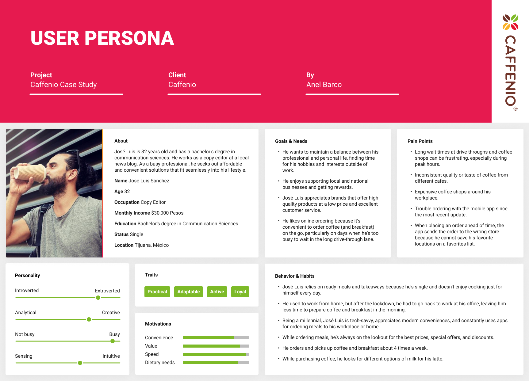
The competitive analysis and user interviews gave me a better understanding of who the users were and how they use the Caffenio app. I focused on expanding those findings into concrete visualizations that would help me empathize with users and define the product redesign.
Research & Insights
To uncover why users weren’t adopting the pick-up flow, we combined quantitative analytics with qualitative interviews:
Analytics Review
• Examined app usage data and drive-thru transaction logs to pinpoint drop-off points.
• Found that 65% of users opened the app’s home screen but only 8% tapped “Pick-Up” before navigating away.
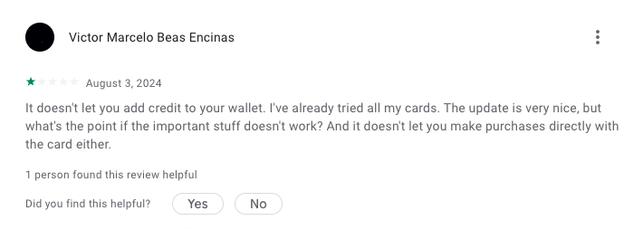
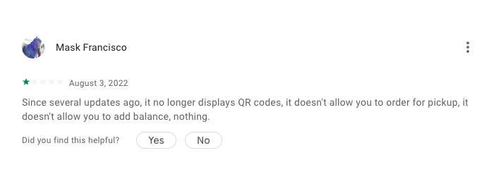
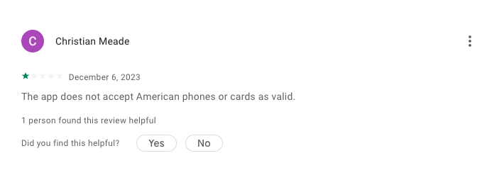
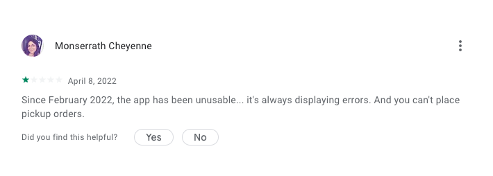
• We found that users couldn’t top up their in-app wallets with credit or debit cards and some U.S. customers were unable to register because the system wouldn’t accept American phone numbers.
User Interviews
• Spoke with 5 frequent Caffenio customers who had used both drive-thru and pick-up.
• I discovered that many users skipped the “Pick-Up” flow because they couldn’t pay directly with their credit or debit card, only by preloading their in-app wallet, which felt inflexible.
• Several worried their order wouldn’t be ready when they arrived, so they defaulted to waiting at the kiosk for real-time confirmation.
Competitive & Contextual Review
• Benchmarking against leading coffee chains showed that top performers surface “Reorder” buttons prominently on the home screen.
• Observed that few apps delivered clear progress indicators during the ordering process, leading to uncertainty.
Key Insights
-
Discovery Gap: Customers can't use the pickup option if they cannot make online payments, they know "Pickup" it’s the fastest option but they're unnable to use this feature.
-
Trust Barrier: Without explicit readiness confirmations, customers hesitate to leave home or workspace for fear of wasting a trip to their local Caffenio.
-
Workflow Friction: Too many screens and unclear visual cues cause users to abandon the flow and default to drive-thru kiosks.
Armed with these insights, I was ready to ideate targeted solutions: elevating pick-up access, enabling credit-card payments without requiring users to add funds to their wallets, allowing American customers to register with their U.S. phone numbers, and streamlining the multi-step flow.
Wireframes & Prototype
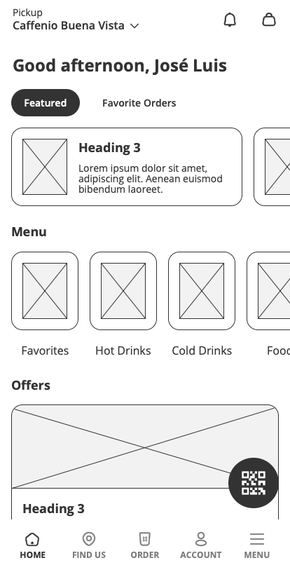
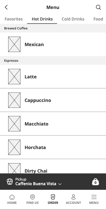
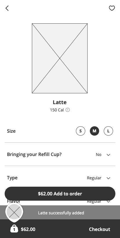
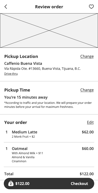
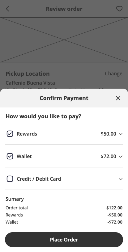
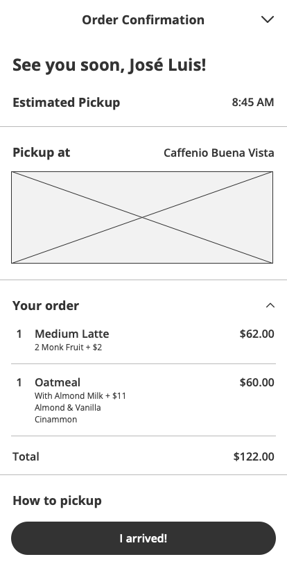
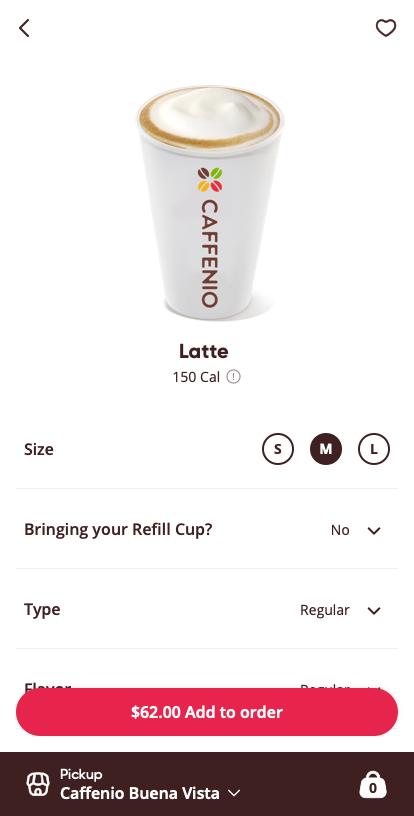
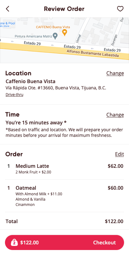
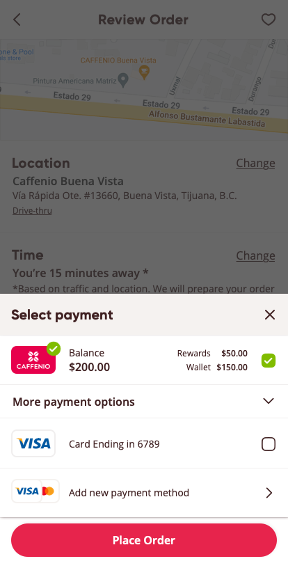
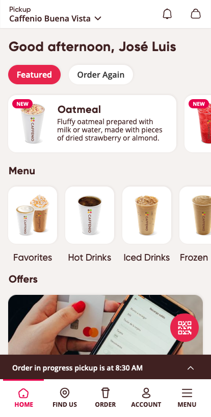
I started by sketching simple screens that prioritize favorite orders. Next, I turned those sketches into clickable mockups that let people tap through the order steps, choosing their favorite drink, picking how to pay with a credit card or mobile wallet, and seeing when their order is ready. I tested these screens with real users, gathered feedback, and tweaked the flows until each step felt clear and easy.
Final Design
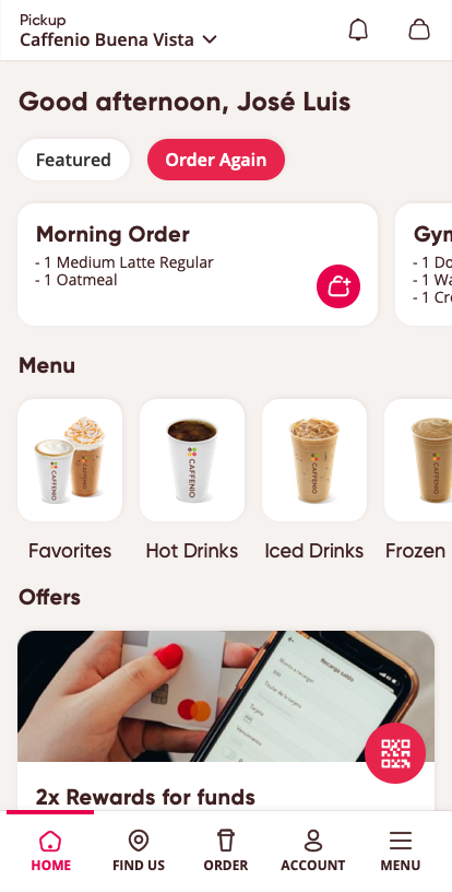
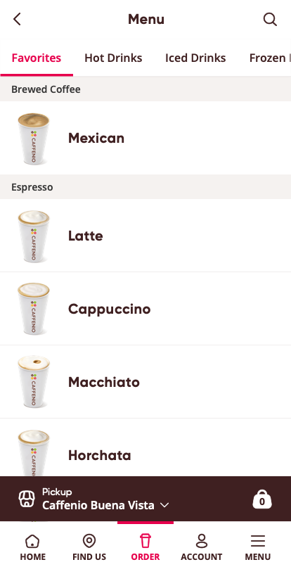
I tested the clickable prototype with five people to make sure it felt easy to use. Each person was asked to pick a saved favorite, choose how to pay, and check when their order would be ready. I timed how long it took and noted any moments of confusion, like finding the “Favorite Orders” button or finishing the credit-card payment. After two quick rounds of tweaks, the average time fell from 90 seconds to under 60 seconds, and everyone completed the task smoothly on their first try. This gave me confidence that the new design really makes ordering and pickup faster and simpler.
Project Reflection
- Monitor Rollout Metrics: Launch the updated pick-up flow with selected users and track app adoption rates, order completion times and payment success.
- Gather Continuous Feedback: Deploy brief in-app surveys after pick-up to capture any remaining pain points or suggestions.
- Tackle Payment Bugs: Partner with engineering to resolve any lingering credit-card integration issues and ensure the checkout remains reliable under scale.
Round-Up
This project revealed that making favorite drinks easy to find and smoothing out payments can truly transform the "Pickup" experience. By testing early prototypes with real customers, listening to their feedback and making quick tweaks, we cut ordering time by a third and made pick-up feel almost effortless. Next, I’ll keep tracking the data and gathering user insights so I can continue improving the "Pickup" feature that people truly love and trust every day.
Quick-links
Final Design: Axure Prototype
Synthesized Case Study: Figma
User Persona: Figma (Web&Mobile)
Storyboard: Storyboard PDF