
The Story Graph
Helping bibliophiles discover, organize and analyze their reading journeys.
Overview
The StoryGraph, or “StoryGraph,” is a social cataloging web/mobile platform for books, serving as a competitor to Goodreads. The StoryGraph received awareness after Book Riot covered the platform’s assets, including more personalized recommendations for readers, customized rating options (including half-star and quarter-star ratings), and its non-affiliation with Amazon. The StoryGraph uses a freemium model, with some features only available in the paid subscription plan.
Purpose
Understand user needs, behaviors, and pain points. Identify opportunities for improvement where the user experience can be enhanced or optimized to meet the user’s expectations. Communicate findings, insights, and solutions derived from the case study. Ultimately, the purpose of this case study for The Story Graph is to drive improvements in the platform’s user experience, resulting in increased user satisfaction, engagement, and loyalty.
Role: Product Designer
Skills: User Research, Interaction, Visual design, Prototyping & Testing, Information Architecture
Tools: Figma, Photoshop, Illustrator
Project Duration: 40 Hours
Prototype: TheStoryGraph
Understanding the problems
- Navigation Issues
- Searching and importing books.
- Overuse of dropdowns and button styling alternatives.
Methods used in this case study
- Contextual inquiry.
- Usability testing.
- Heuristic evaluation.
Contextual inquiry & Usability testing
For this study, I conducted contextual inquiry and usability testing with two users of TheStoryGraph app.
These users were:
- User 1: female student, 27 years old, Mexican.
- User 2: male assistant produce manager, 37 years old, American.
They both haven’t used the app before and they are tech-savvy.
- User 1: contextual inquiry and usability testing were performed through a video call and screen sharing. The user was asked to perform the tasks that I would go into greater detail about in the next pages.
- User 2: contextual inquiry and usability testing were performed in person, and both users were asked to perform the same tasks.
Heuristic Evaluation
This is is a method for identifying design problems in a user interface. I compare the design against a set of guidelines (called heuristics) that make systems easy to use.
Navigation Issues
Background
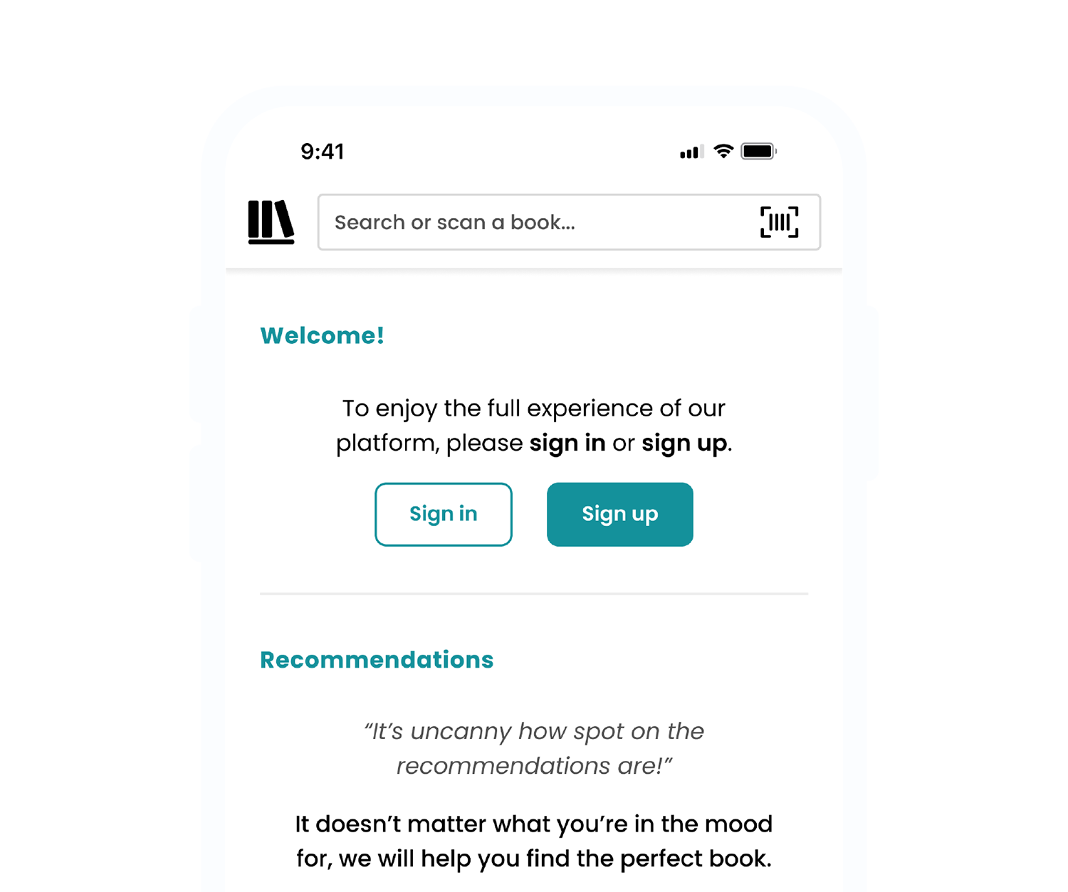
When the users downloaded the app for the first time, this is what they saw (Figure 1) compared to Goodreads (Figure 2). At Goodreads, the user cannot access the app without an account. I think we shouldn’t force the users to create an account as soon as they download the app. I believe it’s beneficial to offer users a trial of the app before they sign up.
The “sign-in” or “sign-up” interaction is not visible on the homepage when the user downloads the app for the first time unless they search for the sign-in link inside the hamburger menu (Figure 3). The icons in the footer menu are missing text, and some icons are not self-explanatory (Figure 4). The background and separation of the footer make it hard to identify that this is a footer menu compared to Goodreads (Figure 5).
Some elements in the section “My account” repeat themselves inside the hamburger menu, such as name and photography. Suppose the user opens the hamburger menu while in the “My account section,” they will see the following (Figure 6).

Figure 1 (TheStoryGraph app)
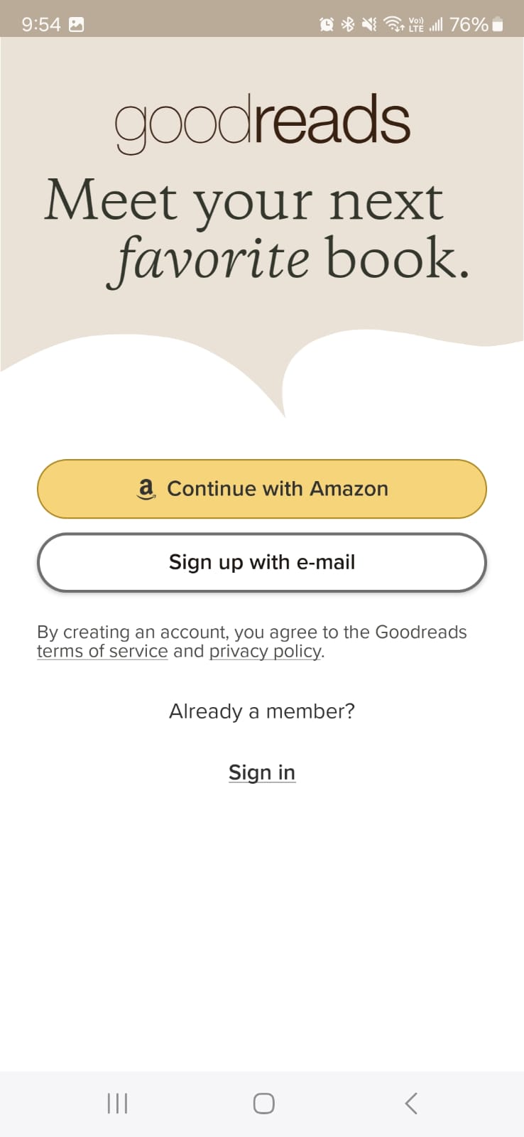
Figure 2 (Goodreads app)
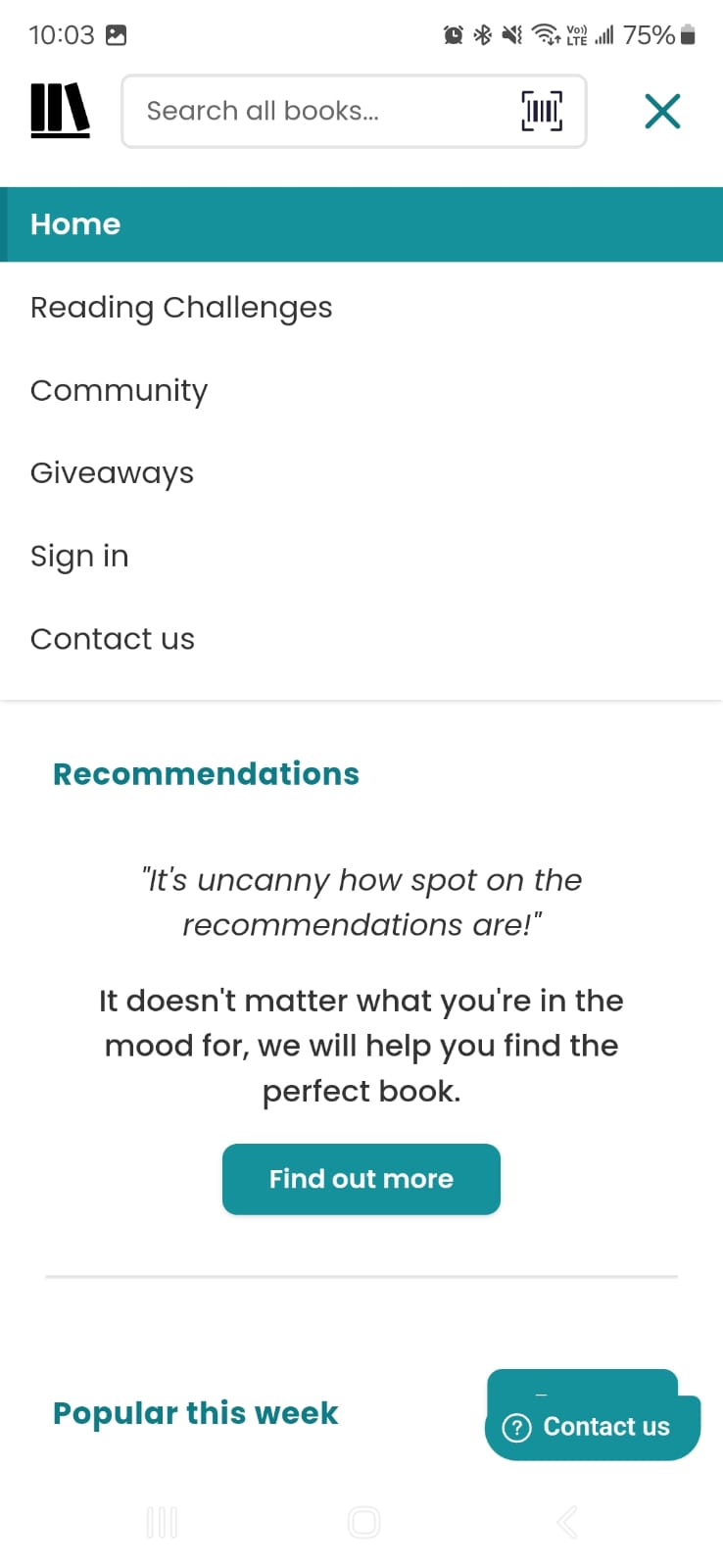
Figure 3 (TSG-Menu, not logged-in)
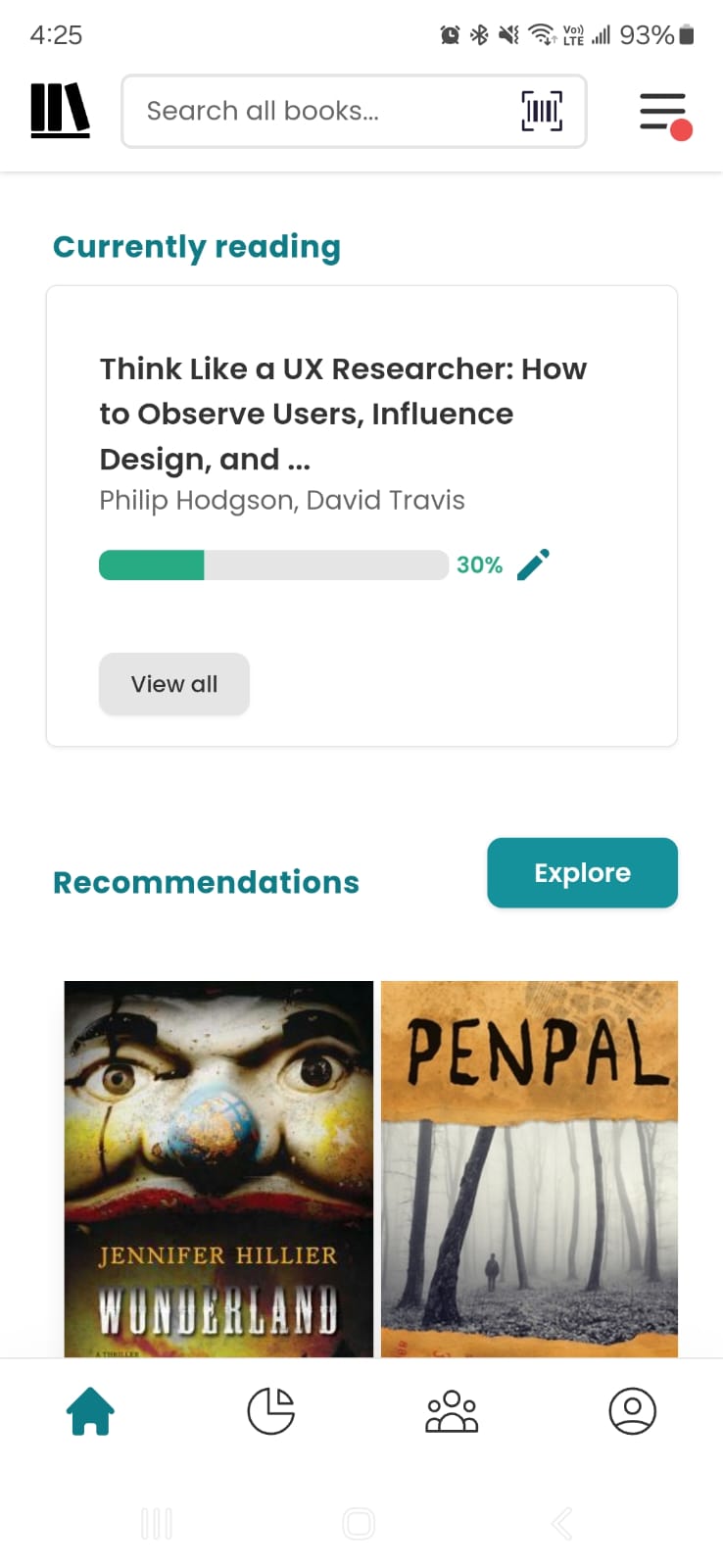
Figure 4 (TSG-Home, logged-in)
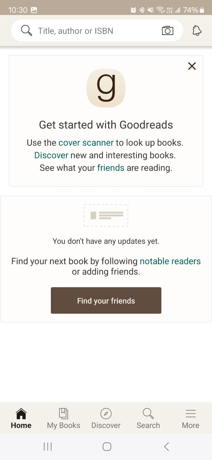
Figure 5 (GR-Home, logged-in)

Figure 6 (TSG - Hamburger menu open)
Figure 5 (GR-Home, logged-in)
Figure 6 (TSG - Hamburger menu open)
Why is this a problem?
We asked our two new users to search for a book and mark it as read. These are the results:
None of our Users¹ knew they had to have an account to perform the task of searching for a book and marking that book as “read.” The users searched for a book, and when marking the book as “read,” they encountered they needed to “create an account” or “sign in.” The users created a new account, User 1¹ noticed they weren’t redirected to the screen they were at before creating an account; they had to perform the search again. As a result, they performed the task of searching for a book twice, plus an extra task of creating an account, to achieve the initial task.
Only User 1¹ guessed correctly when asked to interpret the icons in the footer menu, not taking into account the “home” and “my account” icons.
User 1¹ and User 2¹ were confused as to why the hamburger menu repeated the same elements that are in the footer and my account; they found it too cluttered. User 1¹ noticed that if they scrolled the menu, the current page at the bottom would scroll, and tapping outside of the menu didn’t close the menu.
¹Source: Results of contextual inquiry and usability testing. Conducted by Anel Barco.
Solution
Create a sticky footer menu for new users and not-logged-in users. Also, make sure to take the new user back to the screen they’re initially on before creating an account after finishing the process of creating one. Add text beneath the icons in the footer menu and create a visual separation between the footer menu and the main content. Eliminate the hamburger menu for logged-out or new users since most of the links and elements repeat themselves in the footer menu, and the rest of the elements will not be available for them because they don’t have an account or are not logged in.
Figure 7 (Before)
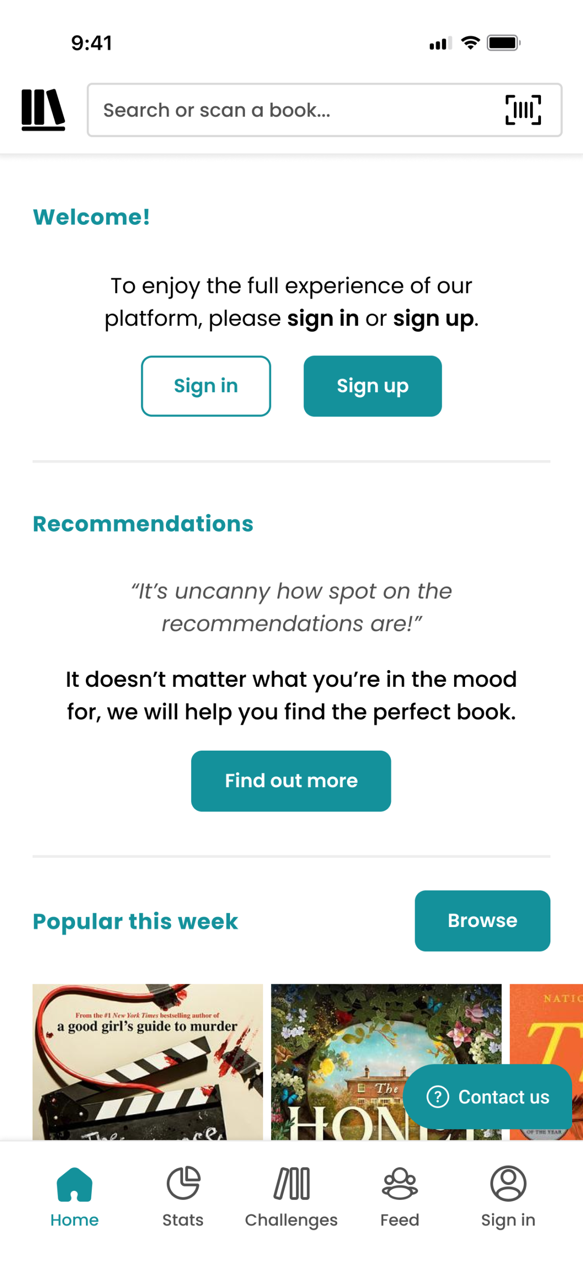
Figure 8 (After)
Figure 9 (Before)
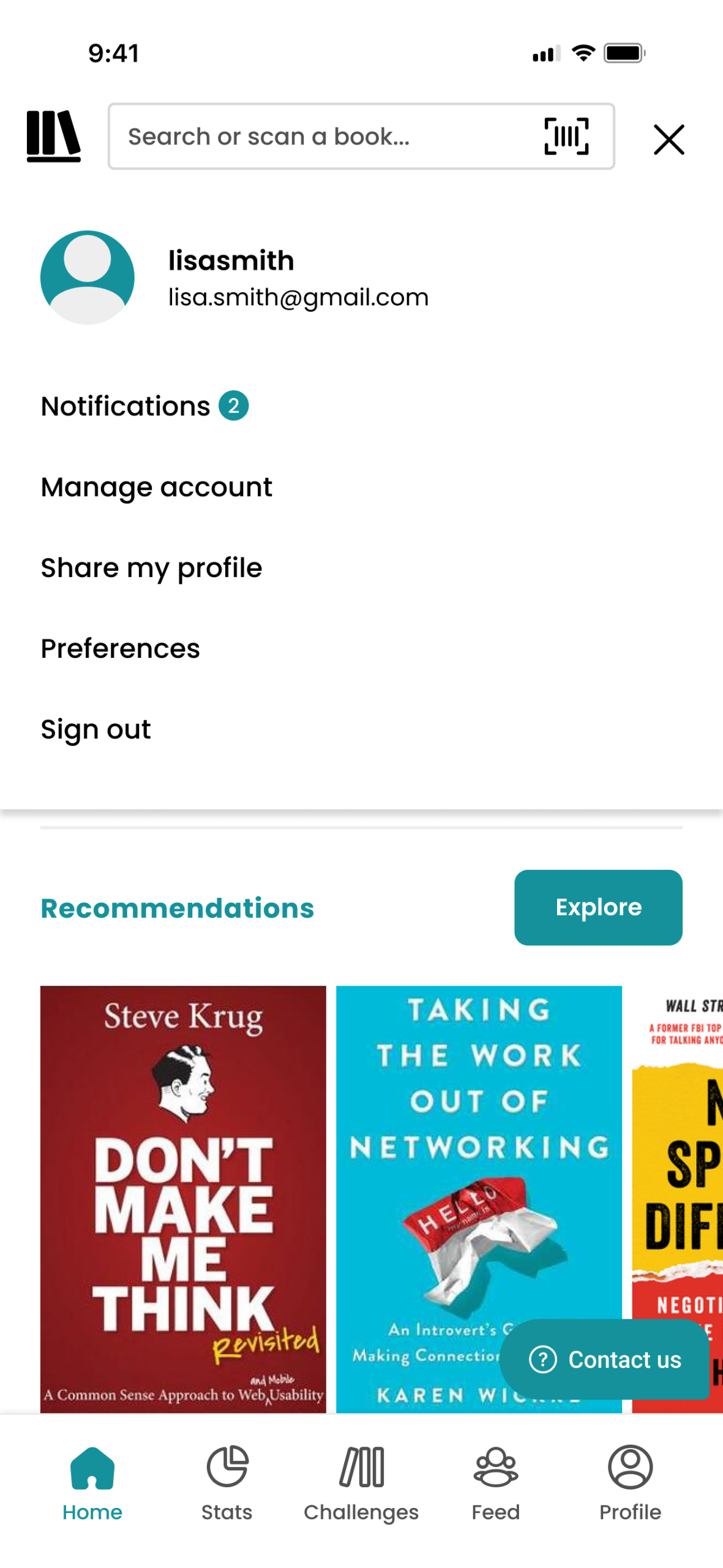
Figure 10 (After)
Why is this a solution?
By creating a sticky footer menu for new users and not-logged-in users, they can perform the sign-in or sign-up process action with a tap of a button in the sticky footer instead of figuring out how they can create an account or sign-in. This also gives the user a notion of what they can accomplish inside the app once they can create an account by looking at the menu items. According to Jakob Nielsen², “When users know the current system status, they learn the outcome of their prior interactions and determine next steps. Predictable interactions create trust in the product as well as the brand.” It has to be remembered that these are the first interactions the user gets from the app; we need to provide guidance.
If we compare the footer menu to Goodreads and other apps like Uber, Uber Eats, TikTok, YouTube, Airbnb, etc., we can find they all use text under most, if not all icons. Jakob’s Law states that² “people spend most of their time using digital products other than yours. Users’ experiences with those other products set their expectations. Failing to maintain consistency may increase the users’ cognitive load by forcing them to learn something new.”
By removing the hamburger menu to new or logged-out users, we achieve simplicity; we will remove duplicate links and elements.³ “Duplicating features adds significant overhead to both the scanning process and the comprehension process. Furthermore, because users don’t know for sure when a feature is duplicated, they’ll have to spend additional time figuring out whether the duplicate is a new feature or an old feature. In user testing, we frequently observe users clicking a second link to a page, even though they’d already visited that page earlier through a different link. Wasted effort.” All the mentioned apps above except Goodreads don’t have a hamburger menu, but Goodreads doesn’t have a “my account” icon at the bottom of their footer menu.
² Jakob Nielsen 2024, 10 Usability Heuristics for User Interface Design, Nielsen Norman Group, accessed 24 April 2024.
³Jakob Nielsen 2002, Reduce Redundancy: Decrease Duplicated Design Decisions, Nielsen Norman Group, accessed 24 April 2024.
Searching and importing books
Background
The search bar and barcode scanner icon on The Story Graph (Figure 11) compared to the one in Goodreads (Figure 12). The camera icon in Goodreads is more visible than the one in TSG.
The barcode in the search bar goes unnoticed by users (Figure 11), the “close” search icon overlays on top of the barcode icon once a search is done (Figure 9), the search by scanning doesn’t work properly all the time (Figure 10.1 & 10.2), and the user cannot perform a search by ISBN in the search bar like Goodreads (Figure 11).
Figure 11 (TheStoryGraph search bar)
Figure 12 (Goodreads search bar)
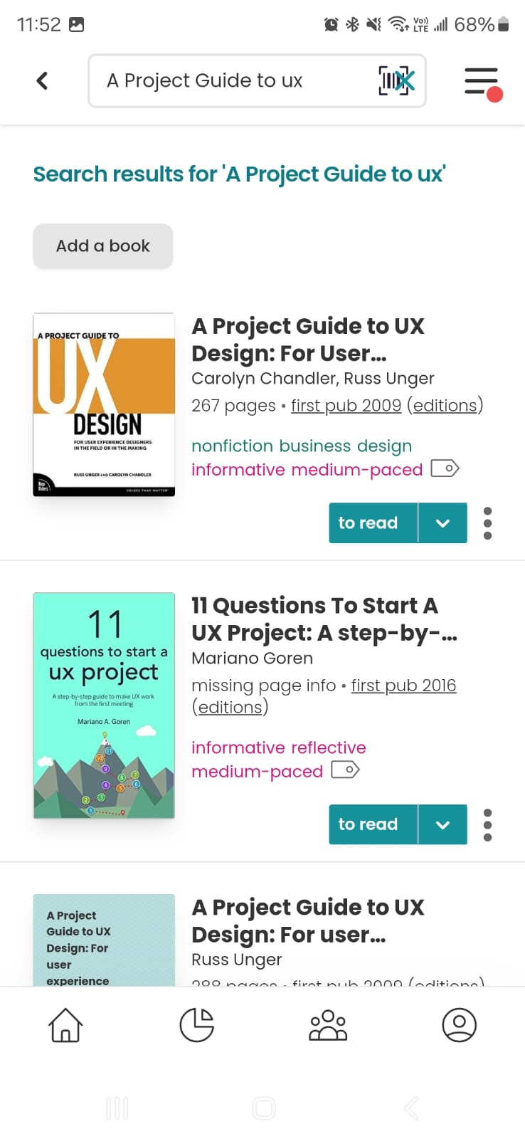
Figure 13 (TSG Search)
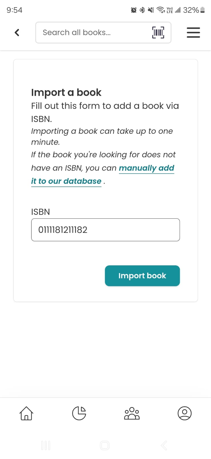
Figure 14.1 (TSG Search by barcode scanner)
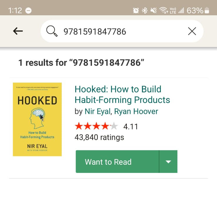
Figure 14.2 (Book scanned)

Figure 15 (Goodreads Search by ISBN)
Figure 14.2 (Book scanned)
Figure 15 (Goodreads Search by ISBN)
Why is this a problem?
When both of the new users were asked to search for a book, we found the following:
None of the new users¹ used the search by barcode scanning option because they didn’t notice the icon in the search bar at first glance when performing the task. When they noticed or were told to use it, they felt they wasted time by typing instead of scanning. Our two users found out the scanner did not work properly. When users were asked to search for a book by ISBN, both users realized they could not perform a search by ISBN on TheStoryGraph app.
¹Source: Results of contextual inquiry and usability testing. Conducted by Anel Barco.
Solution
Remove the icon of the barcode scanner when the user is in the search results. Fix the search by barcode scanning because it does not provide the correct ISBN of some books. If there’s a slight suspicion that the ISBN is incorrect, alert the user to double-check the ISBN provided by the system to verify that it matches the ISBN on the book. If possible, provide the user with the option to search by ISBN from the search bar.
Figure 16 (Before)
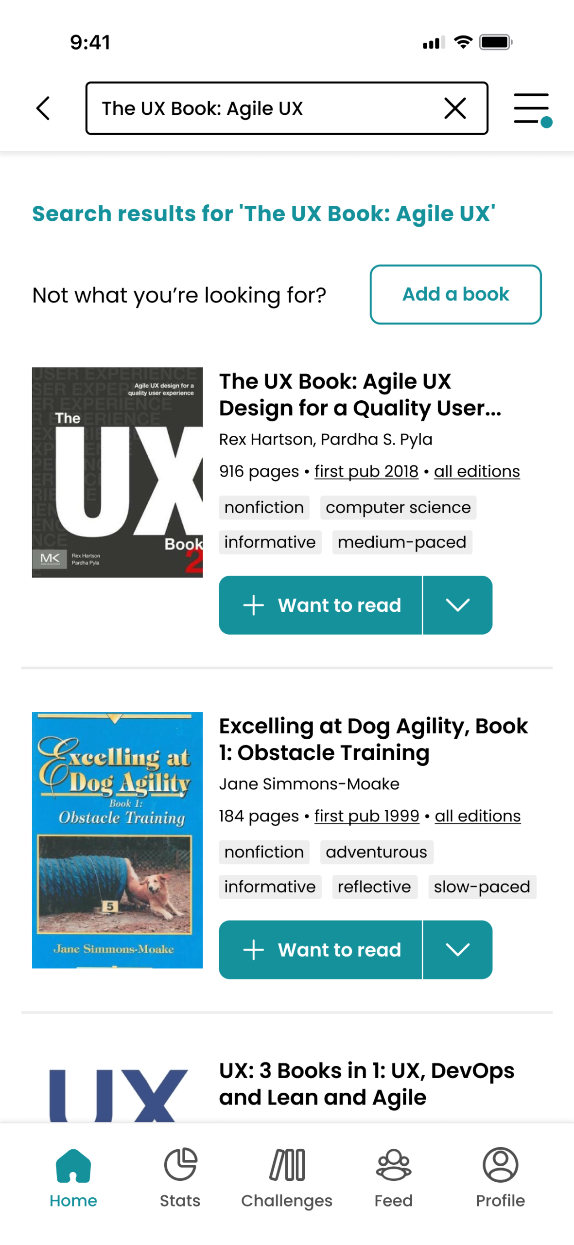
Figure 17 (After)
Figure 18 (Before)
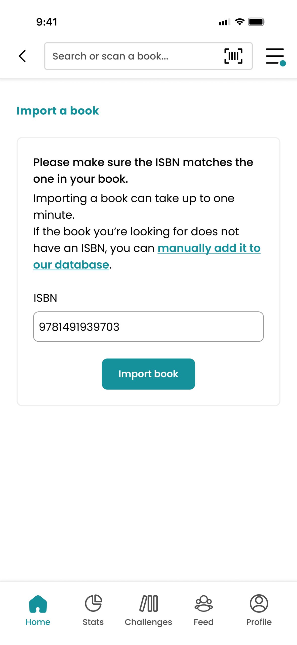
Figure 19 (After)

Figure 20 (New search by ISBN)
Why is this a solution?
If we compare The Story Graph search bar with apps like Goodreads, Vons, and Google (Search with Google Lens), we can find the search bar at the left of the placeholder text, and Google especially does a very good job by identifying the camera icon and microphone icon with different colors.
Removing the barcode scanner once the user is in the search results allows the user to completely see the “close” button.
By fixing the text field of providing either a correct ISBN or giving the user a warning to verify that the ISBN matches the one with their book, we can² “eliminate error-prone conditions, or check for them and present users with a confirmation option before they commit to the action.”
When adding the option to search with the ISBN from the search bar, we provide flexibility and efficiency of use². “Flexible processes can be carried out in different ways so that people can pick whichever method works for them.”
² Jakob Nielsen 2024, 10 Usability Heuristics for User Interface Design, Nielsen Norman Group, accessed 24 April 2024.
Overuse of dropdowns and button styling alternatives
Background
By comparing The Story Graph app side by side with Goodreads, we notice the following differences: While The Story Graph makes better use of space (Figure 21), Goodreads does a better job at making buttons bigger (Figure 22). The Story Graph uses a lot of drop-downs (Figure 23), and Goodreads uses a fullscreen (Figure 24) to display the options available, which is better but still not perfect.
Users can open all the dropdowns at the same time (Figure 25). Buttons are small and lacking style (Figure 26). Buttons don’t follow the order of the flow, as observed (Figure 26). Almost every button or icon interaction is a drop-down (Figure 25, 26 & 27).
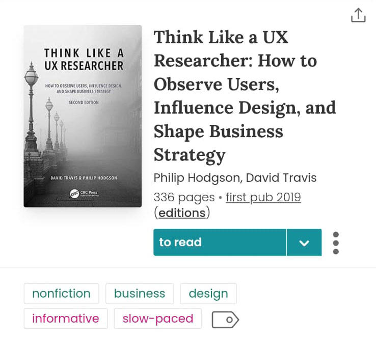
Figure 21 (TheStoryGraph book page)

Figure 22 (Goodreads book page)
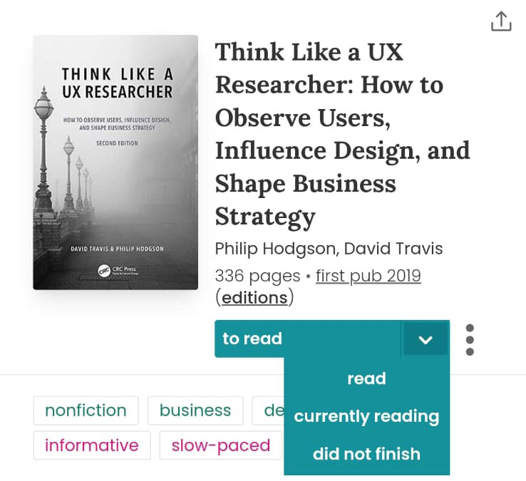
Figure 23 (TheStoryGraph Shelves)
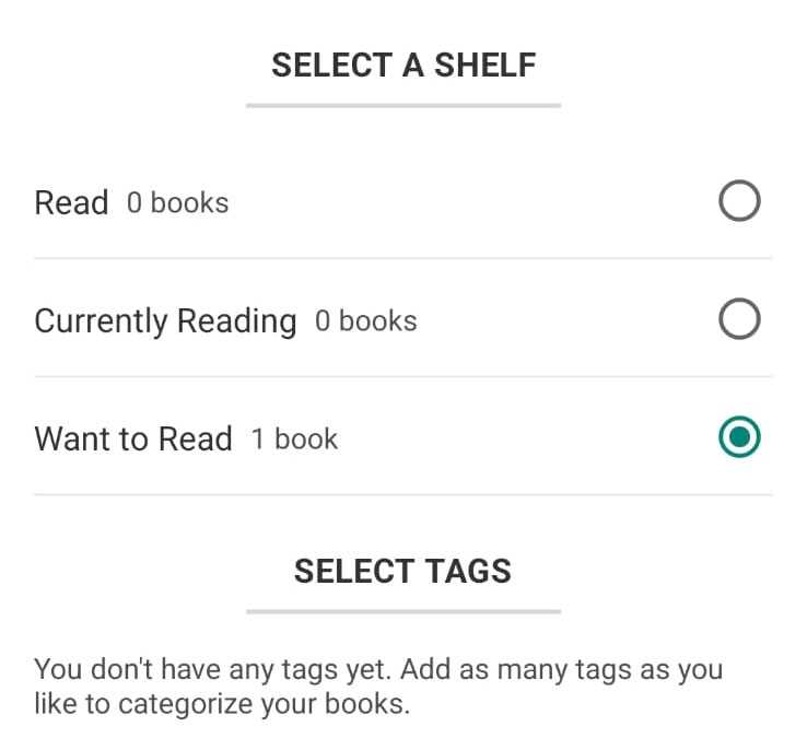
Figure 24 (Goodreads Shelves)
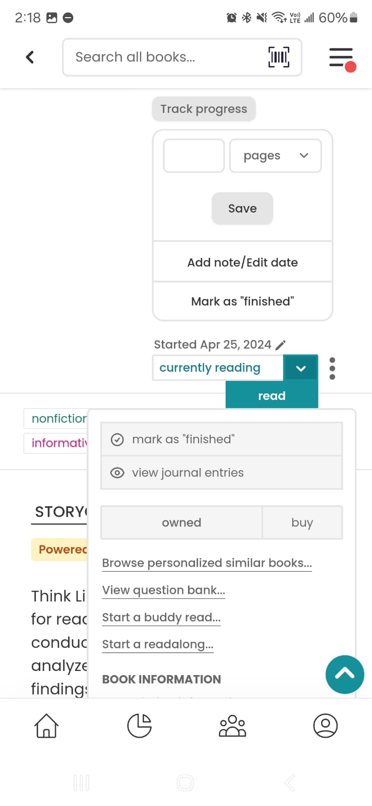
Figure 25 (TSG Multiple dropdowns)
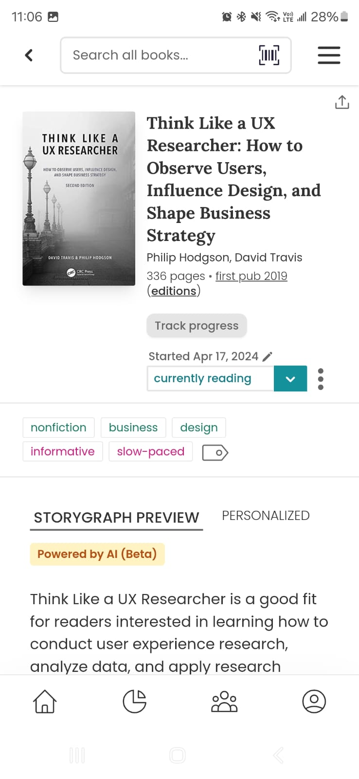
Figure 26 (TSG Track progress)
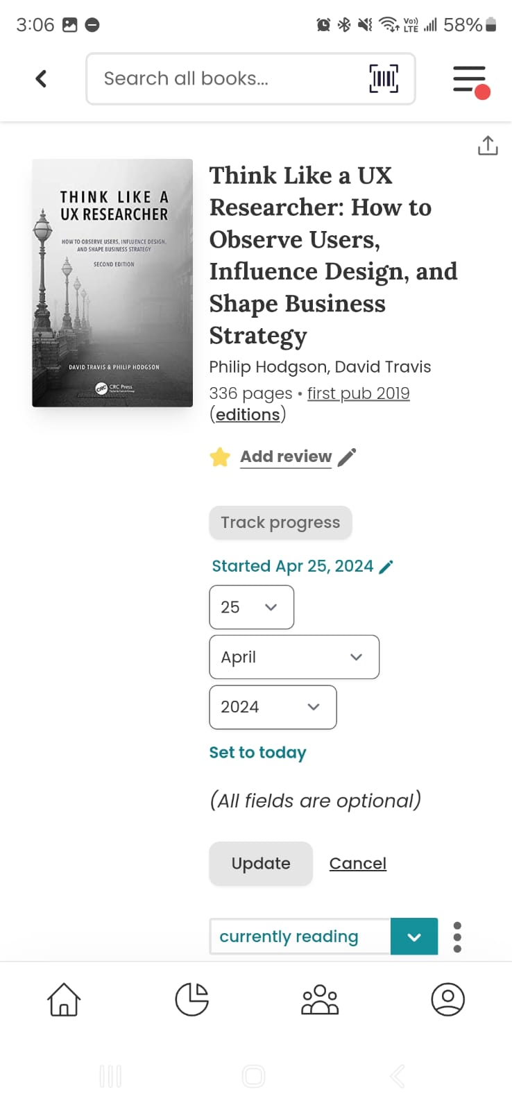
Figure 27 (TSG Track progress)
Figure 25 (TSG Multiple dropdowns)
Figure 27 (TSG Track progress)
Figure 26 (TSG Track progress)
Why is this a problem?
When our new users¹ were asked to mark a book as “currently reading,” these were the results:
None of our users¹ saw the “Track Progress” button that appeared on top of the drop-down where they change the status, and 100% of users1 went to the bottom of the page looking for it. User 1¹ found the button and thought it was disabled because of the styling applied to it, User 2¹ couldn’t find it. Drop-downs should not be used in mobile apps, especially in such a high volume. We encountered the following rating and reviews on this matter (Figure 28 & 29). ⁴
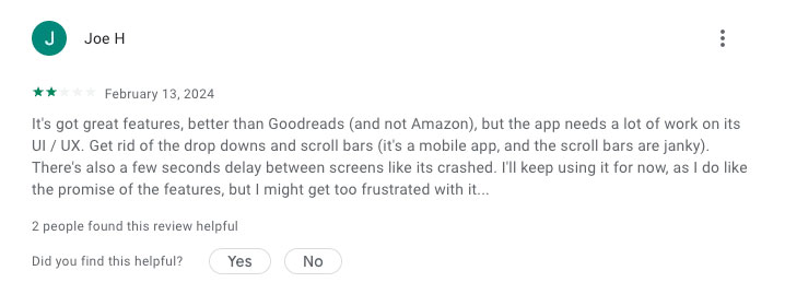
Figure 28 (Google Play Store, review #1)
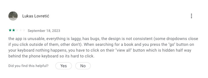
Figure 29 (Google Play Store, review #2)
¹Source: Results of contextual inquiry and usability testing. Conducted by Anel Barco.
⁴Google Play Store. Story Graph Ratings and reviews. Accessed 24 April 2024.
Solution
Replace drop-downs, gather all the related options from the drop-downs and use different components to present the information, such as but not limited to: bottom sheets, action sheets, tabs, steppers, etc. Stylize buttons to make them bigger and apply color elements so they don’t look disabled. Display new elements to the user in reading order (from left to right and then down).
Figure 30 (Before - Bookpage)

Figure 31 (After - Bookpage)
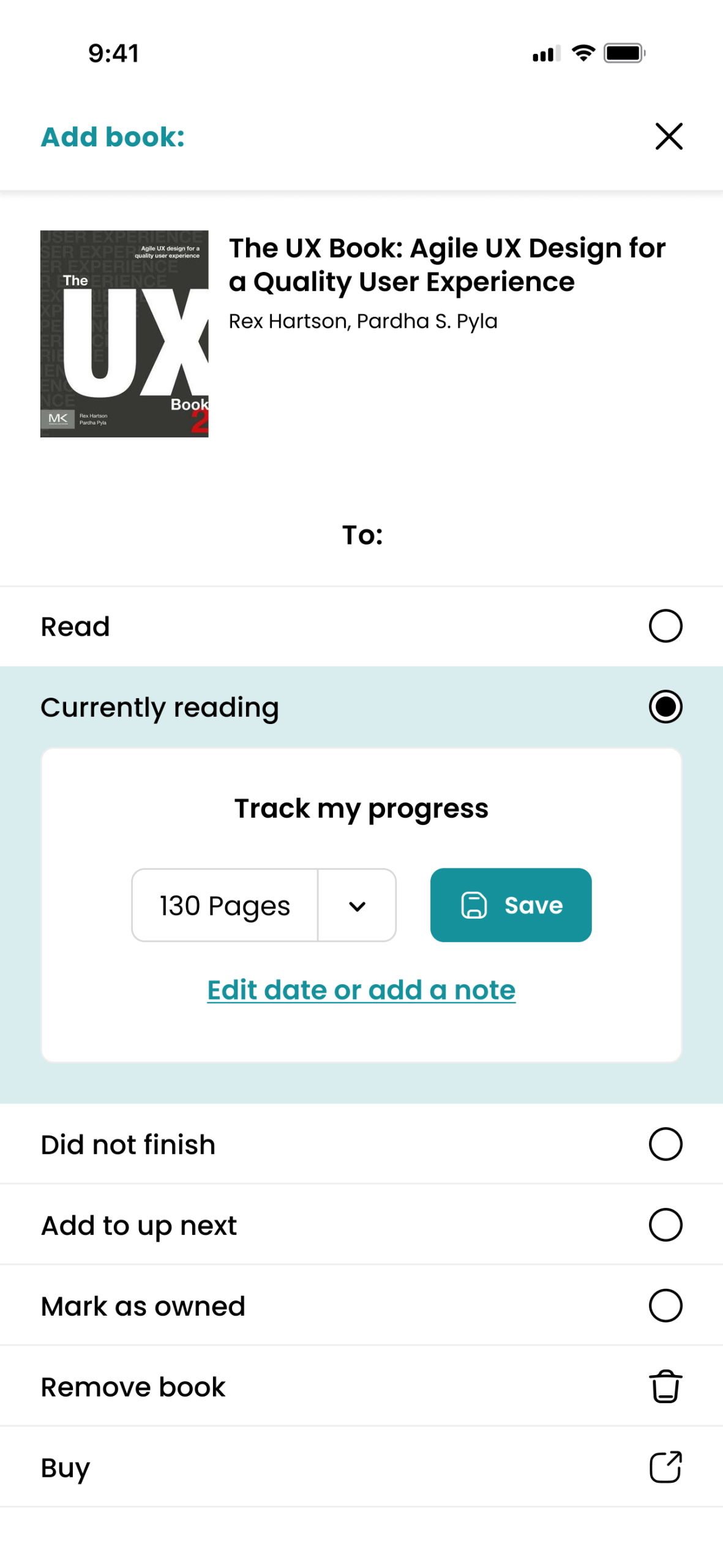
Figure 31.1 (After - when tapping arrow)
Why is this a solution?
If we compare The Story Graph drop-downs with apps like Goodreads, Airbnb, and Uber, we can find that they don’t use drop-downs to ask users for their information. Most of them use bottom sheets. When we need the user to input information such as dates⁵, “most sites use a calendar date picker when asking users to input dates. If users come to your site and are presented with an open field, they will have to spend extra time thinking about which format they should use when entering the date.”
By having the same style and size of buttons, we ensure consistency on pages and button layouts⁵. “There are styles and elements that you can reuse, such as headings, call-to-action buttons, and navigation. Decide where those elements will live and make them consistent across all pages whenever applicable.”
When new information is displayed to the user that’s not in a pop-up window or bottom sheet, we must present the information according to the hierarchy patterns⁶. “There are common patterns for hierarchy both on the printed page and on the digital page. These patterns are based on the movements that our eyes tend to make when presented with a fresh page.”
⁵ Rachel Krause 2021, Maintain Consistency and Adhere to Standards (Usability Heuristic #4), Nielsen Norman Group, accessed 24 April 2024.
⁶ Mads Soegaard 2021, Visual Hierarchy: Organizing content to follow natural eye movement patterns, Interaction Design Foundation, accessed 24 April 2024.
Conclusion
Writing this case study was a challenging but rewarding task. Throughout the process, I had to pay extreme attention to detail and conduct thorough research to ensure the validity and credibility of the findings. From identifying user pain points to brainstorming new approaches, every step required careful thought and analysis. The study’s direction was heavily influenced by feedback from end-users. As the research progressed, there were moments of discovery and insight that helped to improve the user experience of TheStoryGraph app.